Office 365 tenants set to Targeted release should now have the newly announced page header layouts available. This means there are new possibilities to show off your pages and create different layouts to inform your users. In this blog post I will show you how this all looks and how you could setup the different header layout types.
Image and Title layout
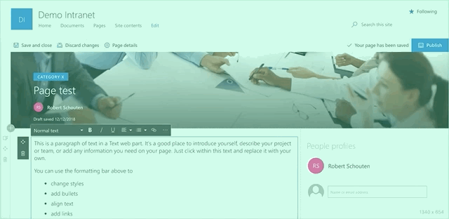
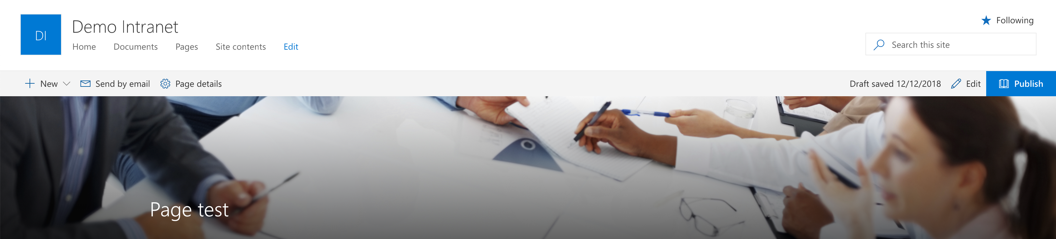
When you start of with a new page, by default, the ‘Image and Title’ layout is set by default. This is actually the layout we used to know on modern pages.

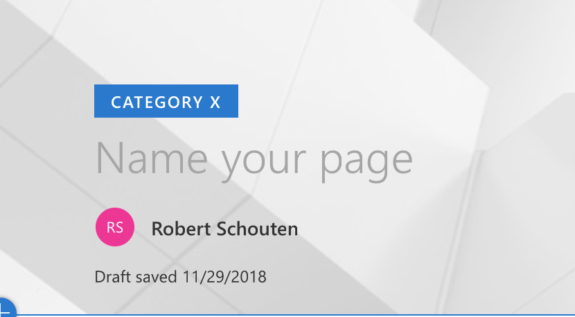
But as you can see, the person who is adding the page is added by default below the page title. You could manually change the person or remove it.
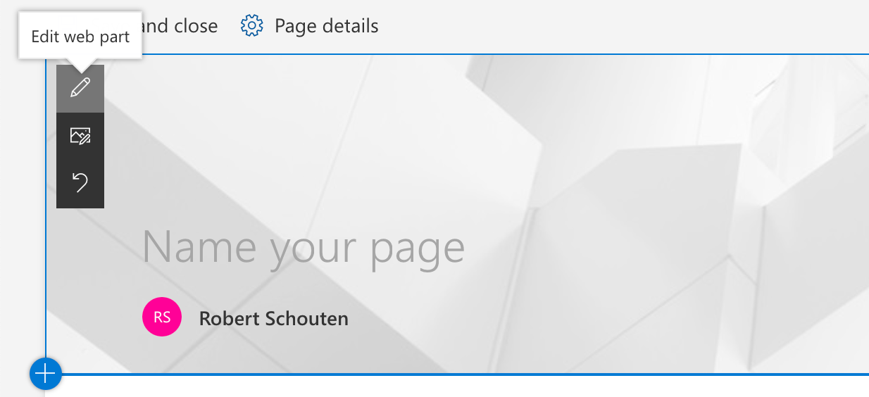
When you hover the header, an extra option is added to edit the web part:
This will open the edit web part panel and give you the option to change the layout of the header or edit the different options for the layout:
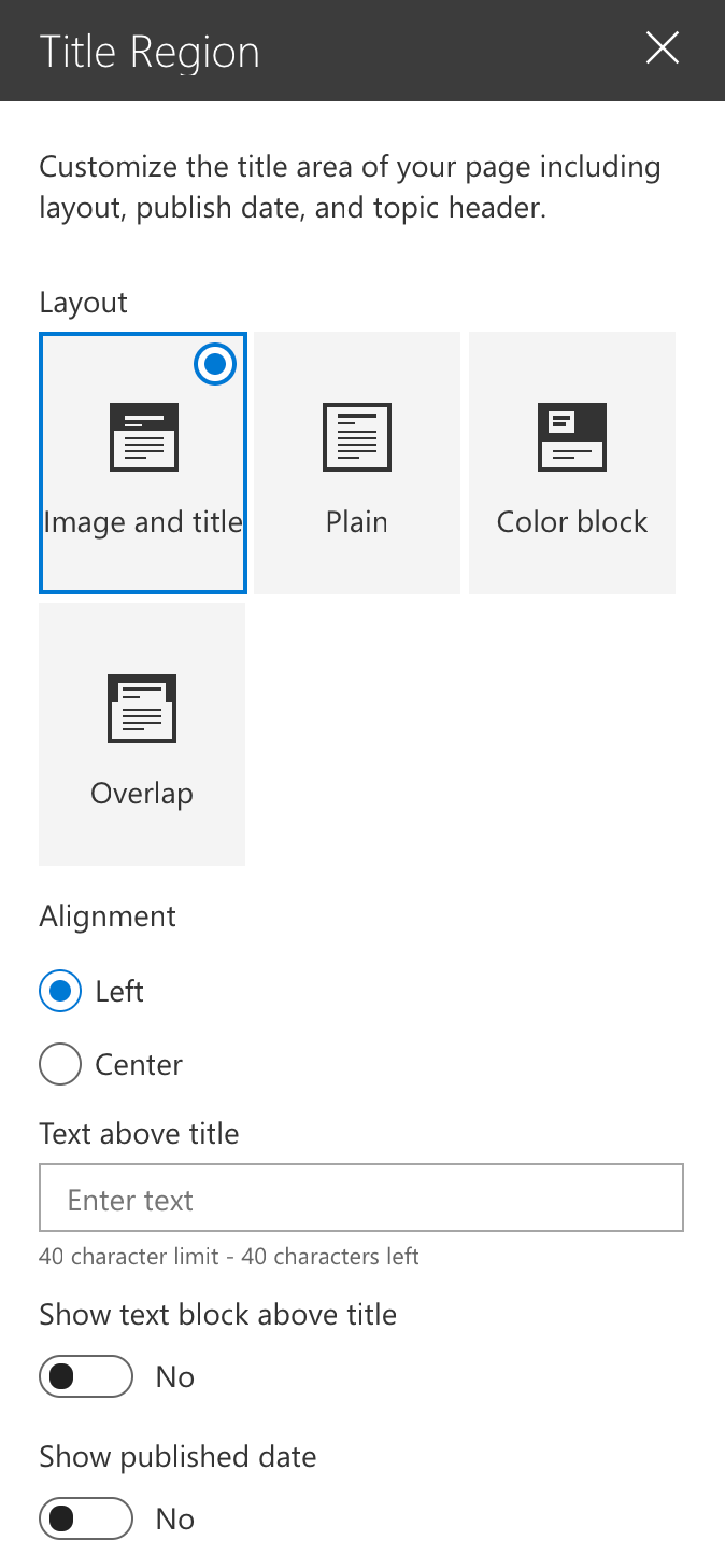
There it is possible to set the alignment of the title to the left or the center. Next to this you could add an extra text above the title, which will have a the primary color of your theme as background color. If you would like to show the published date within the header, you could switch that on too.
Let’s have a look at the difference of the ‘old’ header layout next to this new edition with all options on:

As you can see, the new header is much more appealing than the old one. But wait there is more!
Plain layout
Next to the Image and title layout there is a plain layout. This is for scenario’s where you want to keep your message simple or when you don’t have a nice banner available for you page. In the old situation you would have to delete the image itself to get this. Now it is a bit more user friendly by just switching the layout to the plain option. Nice thing about this is you could switch, without deleting the image. This way you could really inspire someone by easily showing the different options.
The same options are available for you to switch on and off for an extra text above the title, show an author and a publish date. If you want it really plain, you could only show a title if necessary. This way the header doesn’t take so much space on the page.

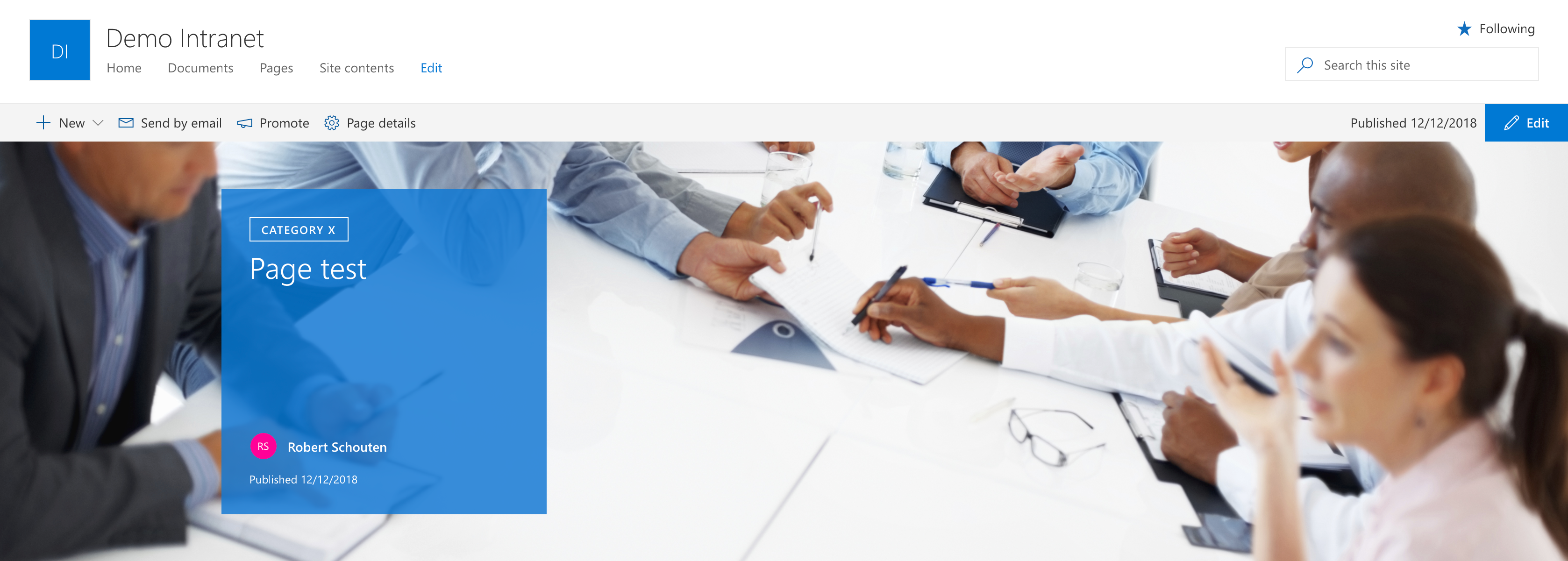
Color block layout
The Color block page header layout is really a new way of showing off your pages. The header is higher and the details of the page header are shown in a coloured block. The background of the block has the primary color from the selected theme for the site. The same information as in the other layouts can be shown:
In my opinion it would have been nice, if we could have the option to add a description underneath the page title. There is pretty much space left there and it gives you the option to give a direct short introduction to the page. Furthermore it is nice to have some different options in the layouts like this.
Overlap layout
The last page header layout option is the Overlap layout. In my opinion a much appreciated option! It combines the header image and the page in an overlap. This way the page becomes really part of the header. Again, the same web part options are available for this layout:

Summary
Overtime, Microsoft adds new features to the SharePoint Modern experiences. Today available for Targeted release, new page header layouts are available. Here you see, Microsoft adds new value to the service where you can take advantage of. Happy playing around with the layouts!


 ROBERT SCHOUTEN
August 11, 2021 at 1:44 am
Thanks Robert! Do you know what’s the ideal image size for Color block layout (or all layout generally speaking)? I’m not able to find this info anywhere online. Thanks a lot!
LikeLike